


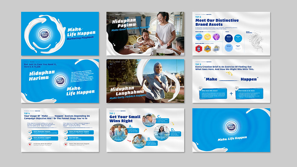


We were appointed by Leo Burnett Malaysia to refine and strengthen Dutch Lady’s marketing playbook. Rather than redefining the brand, the focus was on sharpening how it expresses itself consistently across different touchpoints. Our role focused on evolving the visual language into a more distinctive and usable system. We developed a clearer typographic direction and introduced a custom “milk spill” text treatment, where letterforms are softened and extended to reflect the fluid, organic nature of milk. This was paired with an expanded use of the milk swirl, transforming it from a visual motif into a flexible graphic system across layouts. The result is a more cohesive and recognisable toolkit that enhances consistency while giving the brand a stronger, more ownable expression in market.